
#makeovermonday 2022/W39
Makeover Monday is a weekly development project that allows you to develop your skills in data visualisation by offering a data set every Monday and inviting you to submit your visualisations to the community. It's a source of both feedback and inspiration and a chance to practice some techniques.
For the first time, I've tried to participate
After focussing a lot on robust analysis, software and data engineering, then widening into business process excellence, I've always rather neglected the visualisation part of my role. Or at least the creative side- I can drive the tools and arrive at conclusions but I've certainly never worried to much about graphic design. However, lately I've been considering that a little up-skilling in this area is wise, so I read a bunch of books. So far, so academic, but what really makes you pass the exam is always the practice. So - time to practice. So, a couple of hopes here:
- Practice some key concepts I'd read about
- Get some feedback from people in the community - open myself and my work up for some critique
- Understand how much of the feedback I might receive relates to the analytics standards we've been developing at work
- A bit of creativity
For this week, I had some focus areas
There are a couple of concepts I'd been reading about that I really wanted to practice.
- Restricted colour palette and use of colour very intentionally
- Hidden menus
- Removal of chart junk (i.e. maximise data-ink ratio)
- Active titles
- Do a map(!)
- Table calculations
- Parameter actions
My approach was...hasty
Firstly, I did what I've learned gets results - tell people of my intent to participate, and to make these people ones to whom I felt accountable. That meant I had to actually do it. Then I waited anxiously for the release of the data set. I've learned there is not actually much time between Sunday evening and Tuesday lunch-time (my self-imposed deadline), especially when you've got some other commitments like a full-time job, and ferrying kids to clubs and scouting. I don't think I'd appreciated how tight the time constraint would be - but constraints are in general a good thing.
Sunday night was spent exploring the data - I pulled it into Tableau and attempted to join the English country names in, which meant a few tweaks with non-standard country codes. Then there was some time spent exploring - trying to find interesting features in the data and a story I could tell. By the end of the night, I had a selection of (messy) candidate plots and a few interesting things to say, plus an interesting parameter action experiment to have a user visually divide 100% into three chunks and use the split in calculations (spoiler: I didn't end up using it).
On Monday night at 9pm, I threw together a basic wireframe of what I wanted to build - basically screen shots of the plots I wanted to keep pasted into a powerpoint page in a rough layout, plus some text showing roughly what I wanted to say where. Then I had to build - get everything looking consistent and functional, knowing it was going to be a late one and choosing a simplest possible scheme using as many defaults as I could. I had 99% of this in place by 1am, leaving only a few loose ends to tie up in spare moments on Tuesday morning.
Then I published the vis.

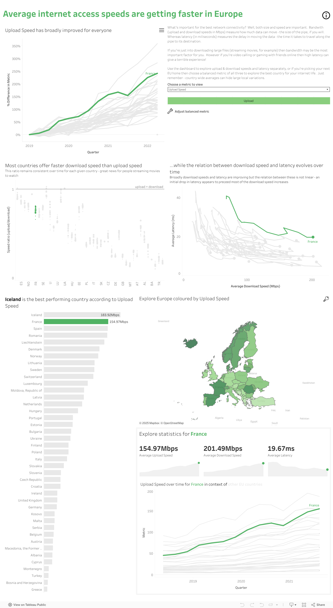
What's the story?
I went down a rabbit hole looking for flight timing data, thinking my angle might be an extension of the conversation with my partner I'd had on Friday, which was broadly "I want to live in another European Country" to which he countered "Okay, but I'll need to be able to fly back to the office in reasonable time and the internet better be good, especially the latency for gaming!". My idea was to make a holistic view of potential country moves to persuade him, but an easy ready-made dataset wasn't findable under an hour, so this was in retrospect wasted valuable time.
In the end, I went with some interesting high level stats on technical progress that lead into a mini dashboard which try to not only tell you about general direction of progress of internet speeds, but also explore an individual country (I'm not letting up on the dream - I think we should move to Iceland). It's not a strong story, and also too much of trying to be two-things-at-once, so in retrospect not the best choice I could have made.
It honestly could be better
I feel like this vis tries to be too many things at once, so that's a bad start. Less is always more and a clear purpose would really have given me more time to focus on the finer things. So let's lay out some of those design and usability tweaks:
I picked one graphical device and rather over-used it. Yes, highlighting one line on a spaghetti plot is cute, but I have two of these time-series line plots plus a third visually similar path plot. The top left plot could probably be removed and the path plot made visually distinct through a different graphical method - perhaps placing the paths instead within a shaded box?

I went down a "scrollytelling" route with a tall dashboard, but realistically the first half is distinct in purpose from the second "country explorer" half. I also made the top half a 50:50 split but the lower half becomes a one-third:two-third split which is visually jarring to add to the sudden switch of purpose. Go me! Really these should be two separate dashboards. I like 9-box split, I should have continued this throughout.

There are many other small data-ink removals that could have neatened it up. More whitespace might have made this feel less cluttered too - I could have allowed for this by making it even taller - may as well be intentional with the scroll.

The leaderboard title almost touches the map title - a crappy case of poor proximity rules being applied. There are areas where titles don't align and it looks naff. There are also some issues with contrast - some font sizes are too similar in places and because I stuck with the default Tableau font throughout there is a lack of type contrast. The whole thing has a very concordant feel, leaving it look modern but rather bland. In places the text is also too small, but more of this later.
There's some missing usability things. I forgot to explain the meaning of the size of the points on the "speed ratio" plot (it's date, if you care). I also omitted a lot of usage guides in my haste, relying on the ubiquity of symbols rather than telling people how to interact with it - oops.
I have failed to explain my "balanced metric" calculation, and have given no data extract dates, comments on data quality, data source attribution and only one disclaimer on the analytics.
In the backend, I did not put nearly enough comments on my calculated fields, failed to name my containers or provide an instructional sheet explaining how some of the mechanics got built. I also didn't run a performance check.
That concludes my confession, your honour.
Transgressions aside, I could have gone further
I could have included more information about the subject area. What sets the download/upload ratio? Why does latency often drop before a country increases the bandwidth? Latency to what, exactly- the nearest datacentre? How does this relate to physical limits placed by geography? Is there a relation to population size or submarine network backbones reaching the country? So much to research to put this data in real context!
I could have gone so much further with the graphical design - I really wanted to try a white on dark schema and change up the fonts for some real contrast and interest. I'd have liked to incorporate some graphical typography elements in the title which implied movement within the design - this would have been a fun exercise to try. The whole thing could have been graphically more adventurous. Some reflection time and testing of alternate designs wouldn't have gone a miss, but hey, you get what you get in under 48hrs.
In addition, the whole thing could have done with more testing and peer review, even if only by my kids and partner. There's at least one instance of missing data (Austria download speed!) which I've failed to handle. In the 60s I could persuade my partner to view it, he spotted a bunch more confusing things too (the metric bar is not explained and looks like a button!)
There were some bits that didn't make the cut - my bump chart and a fun skinny dot plot instead of the leaderboard, plus an interactive bar filter made with parameter actions.
There were some technical challenges
Colouring the bump chart interactively was a pain and part of the reason I dropped it from the final vis. Getting the highlighted line to float above others in the plots was also tricky, not aided by the way I put the final dot (which could have been done in a better technical way).
For some reason the fonts looked huge on my desktop version and overflowed their containers, whilst on Tableau Public they rendered much smaller. So, my finessed vis was unexpectedly bad when published. But there are many aspects about my desktop install which causes the environment to render almost unusably. Maybe it's my PC?
So, what did I learn?
Designing in such a short time-frame is hard.
Audience really matters - without my stakeholders I was a lost soul!
Focus on one aspect of the vis and do it well. Half the story, half the plots, better quality.
Focus on one technique I want to practice. Either story or technique or graphics. Probably not all three at once.
Peer review.
Designing in such a short time-frame really is hard.
Comments
Post a Comment